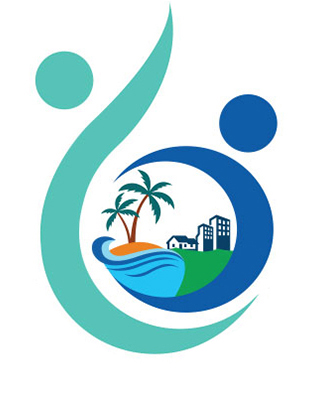
When we were creating our logo, there were a lot of voices, all
pertinent, reasonable and with a point. After taking all of those into
consideration, it was important for us that we create a logo which
was honest and straightforward about our club.
We also wanted to capture the essence of what RBO stood for and
that our logo exuded energy, optimism & hope above everything else.
In keeping the name of our club - Oasis, our logo literally has an oasis
in the centre, depicted by the tree on the ground and a body of water.
The adobe-like structure juxtaposed with the high-rise illustrates the
community we live cohesively with. We can be their oasis and they can be ours.
The bed of green symbolizes our environment, which makes us conscious that it not
just about going green, but protecting our green. Right here. Right now.
We also have two silhouette-like figures protecting the community, the oasis, the eco-system -
those are our members. The circle inside represents the world and in our way we try and protect it.
The whole shape of the logo is like a bluish flame, this is where we draw our energy from. It can
also mean a drop of water, something we need to save. Myriad forms, varied perspectives.
We have consciously limited the colours and stuck to shades of blue and green throughout the logo
with a little bit of earthy colours.
This was done to bring out and portray the environment friendly theme of the RBO logo